To create the poster we used Serif DrawPlus x6 as we are familiar with the software and know how to use it.
An idea we had before even putting pen to paper on design for the Poster was that we knew we wanted the main focus to be an image of the main character and we wanted the faces of 'the suspects' included on the front but we didn't want them to be as definitive as the main image. As a result of this we decided we wanted to fade the images. When we started the poster design, this was therefore one of the first things we did and then hoped everything would come along nicely after that was then visually a success.


 After this, we imported the photo onto the document and also added the other text aspects. For the title of the film on the poster, we used the same font we are trying to use throughout the whole process.
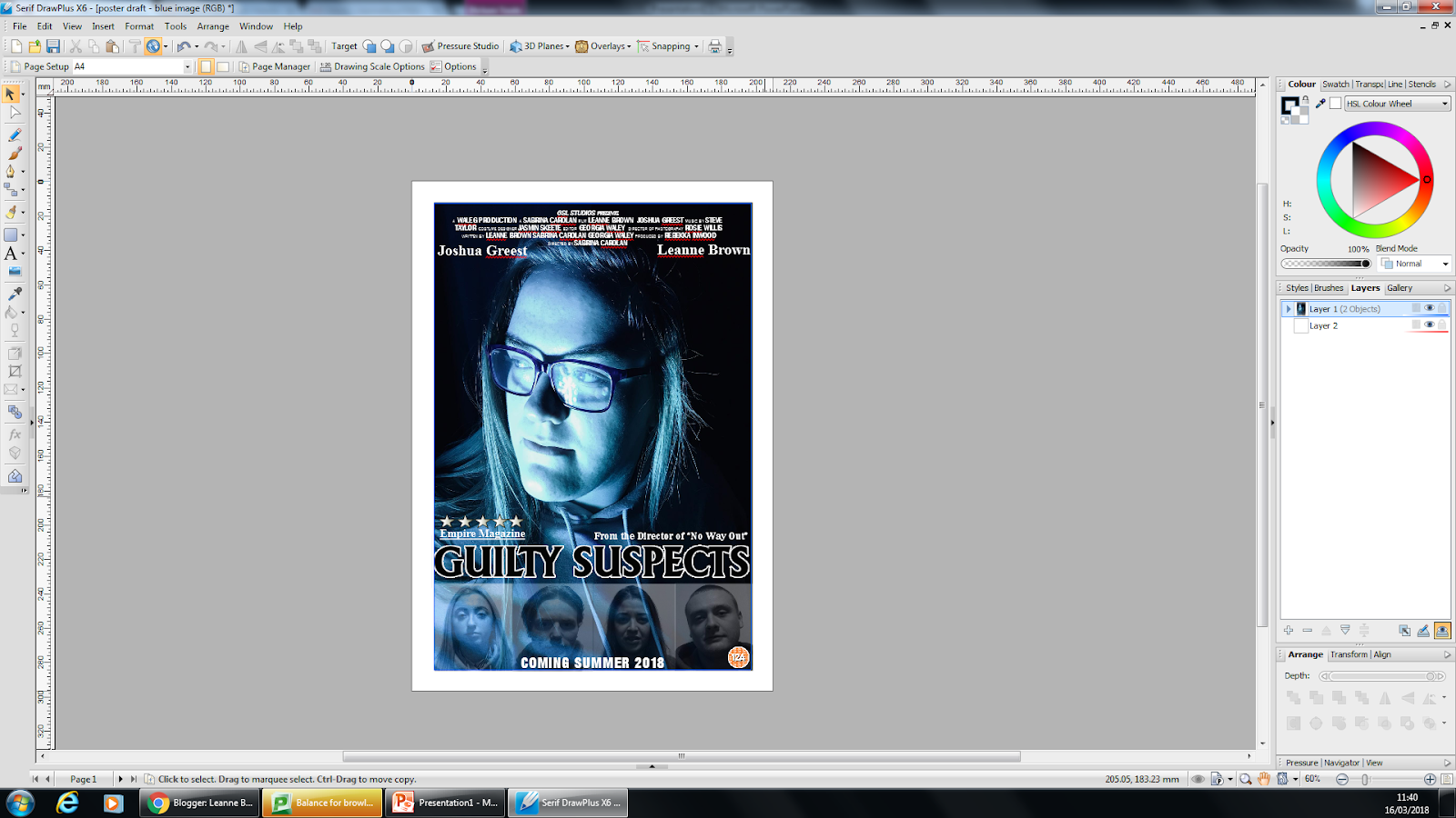
The text and the image were then placed together and this is what the first draft looked like.
On our poster, we decided to add all the conventions as we wanted it to be the best it could for a first draft. For example, we included the billing block, however it is typically at the bottom and we have placed it at the top. We included the names of two actors that can be seen within the trailer so that the audience will recognise these names and then want to watch it even more. We have the release date, an indication as to who our primary audience will be as we've included an image of the age rating the film will be. We have the title of the film being advertised, mentioned work that the director has made before to lure audience in as if they've seen previous work and liked it, they are more likely to watch this one too. Also, we have included a rating from another magazine on the film and poster being advertised.
As I briefly mentioned, there was a disagreement as to which photo we were going to use. This is the design 2/3 members of the group preferred. With this in mind, we then took this layout but changed the image. There were three other photos we were left with.


No comments:
Post a Comment