Showing posts with label Film Poster Research and Planning. Show all posts
Showing posts with label Film Poster Research and Planning. Show all posts
Tuesday, 17 April 2018

Sunday, 15 April 2018
Poster 2nd Draft


Thursday, 22 March 2018
Poster Mark-Up

Within our poster, we included various other features that are features of a stereotypical film poster. For example, we have entered the BBFC rating in the bottom corner, a review and other works the director has produced.
We are well aware of the fact many things are likely to change in the process of putting the film poster together electronically.
Poster Designs - 5 (First Drafts)


 This is an image of the five final poster designs we are left. With these designs, we will carry out a questionnaire and see which one is most successful and use this as our first draft to then apply feedback and changes.
We are well aware that this is only a first draft and that whichever poster we decide to use will only be a first draft and feedback will need to be applied to make changes and there will be other drafts to follow this before the final product.
Poster Drafts and Process
With the poster, it was quite a tough decision when it came to deciding what photo to use as we had a variety of options to chose from. This meant that many versions of the poster were being created at once. We designed two options and decided to then try other images with the design I most liked. Here are some images of the process to making the Poster.
To create the poster we used Serif DrawPlus x6 as we are familiar with the software and know how to use it.
An idea we had before even putting pen to paper on design for the Poster was that we knew we wanted the main focus to be an image of the main character and we wanted the faces of 'the suspects' included on the front but we didn't want them to be as definitive as the main image. As a result of this we decided we wanted to fade the images. When we started the poster design, this was therefore one of the first things we did and then hoped everything would come along nicely after that was then visually a success.
 Here, you see a screenshot of the four 'suspect' characters that we wanted to be imported onto the poster.
 This is an explanation of how we faded the image. This wasn't as hard as we initially thought it would be. There is a brief explanation on this screenshot of how we did the fading. It was a simple process where we changed the colour opacity of the image and brung it lower down to then fade the image. We wanted this to also look similar to head shots that are normally taken of criminals as this is a crime-drama trailer we are advertising.
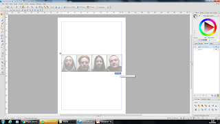 Once we had done this to one image, we did the same for the other three then aligned them up and grouped them together. This was so it became one unit and if we wanted to move the layout around we wouldn't have the line them up each time.
 After this, we imported the photo onto the document and also added the other text aspects. For the title of the film on the poster, we used the same font we are trying to use throughout the whole process.

The text and the image were then placed together and this is what the first draft looked like.
On our poster, we decided to add all the conventions as we wanted it to be the best it could for a first draft. For example, we included the billing block, however it is typically at the bottom and we have placed it at the top. We included the names of two actors that can be seen within the trailer so that the audience will recognise these names and then want to watch it even more. We have the release date, an indication as to who our primary audience will be as we've included an image of the age rating the film will be. We have the title of the film being advertised, mentioned work that the director has made before to lure audience in as if they've seen previous work and liked it, they are more likely to watch this one too. Also, we have included a rating from another magazine on the film and poster being advertised.
As I briefly mentioned, there was a disagreement as to which photo we were going to use. This is the design 2/3 members of the group preferred. With this in mind, we then took this layout but changed the image. There were three other photos we were left with.
To create the poster we used Serif DrawPlus x6 as we are familiar with the software and know how to use it.
An idea we had before even putting pen to paper on design for the Poster was that we knew we wanted the main focus to be an image of the main character and we wanted the faces of 'the suspects' included on the front but we didn't want them to be as definitive as the main image. As a result of this we decided we wanted to fade the images. When we started the poster design, this was therefore one of the first things we did and then hoped everything would come along nicely after that was then visually a success.


 After this, we imported the photo onto the document and also added the other text aspects. For the title of the film on the poster, we used the same font we are trying to use throughout the whole process.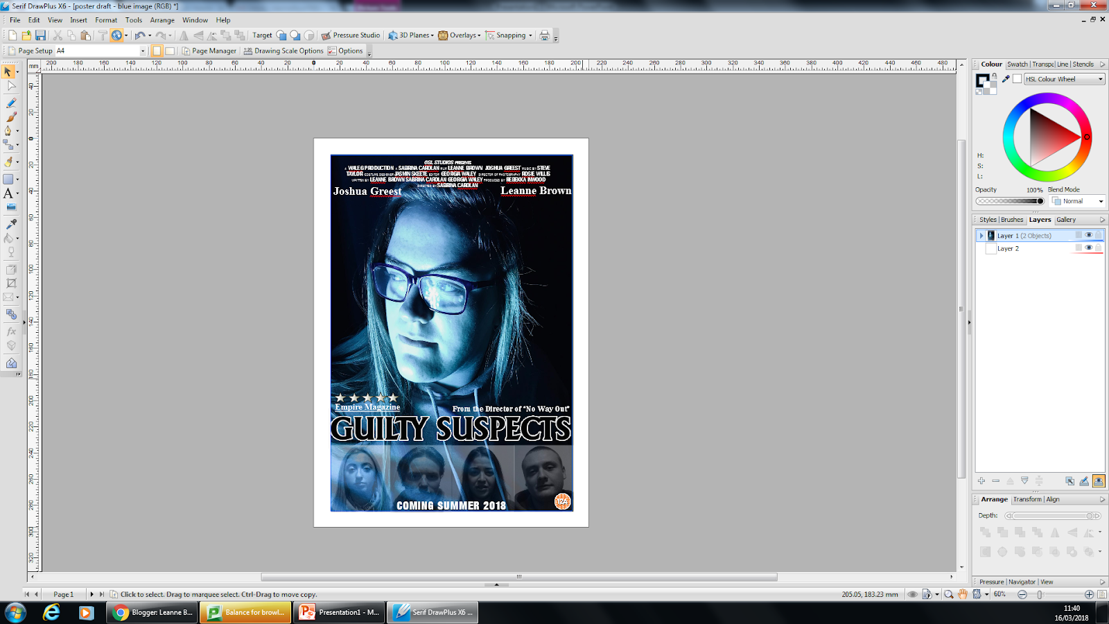
The text and the image were then placed together and this is what the first draft looked like.
On our poster, we decided to add all the conventions as we wanted it to be the best it could for a first draft. For example, we included the billing block, however it is typically at the bottom and we have placed it at the top. We included the names of two actors that can be seen within the trailer so that the audience will recognise these names and then want to watch it even more. We have the release date, an indication as to who our primary audience will be as we've included an image of the age rating the film will be. We have the title of the film being advertised, mentioned work that the director has made before to lure audience in as if they've seen previous work and liked it, they are more likely to watch this one too. Also, we have included a rating from another magazine on the film and poster being advertised.
As I briefly mentioned, there was a disagreement as to which photo we were going to use. This is the design 2/3 members of the group preferred. With this in mind, we then took this layout but changed the image. There were three other photos we were left with.
Monday, 5 March 2018
Film Poster Analysis (3)
TITANIC – FILM
POSTER ANALYSIS

I have chosen to analyse this film poster as its genre is
drama and that is a sub-genre for my coursework. Analysing a drama poster as
well as crime posters will help me better the film poster I end up creating for
my crime-drama poster.
This film poster follows many of the conventions that have
been put in place. For example: eye catching, captivating, there is a picture
as the focal point to lure in the audience, the font is large bold and stands
out, it is designed to attract a mass audience, there is a billing block
evidently at the bottom, and we are shown a hint of who the main characters are
likely to be.
The first thing that stands out to me is the image placed at
the top centre of the page as the colour has been sharpened to stand out even
more. This image acts as an indicator as to who the two main characters are. On
any good film poster, there should be an image on the front to make it stick
out and more appealing to the audience.
The title text on this poster has been designed well as it
clearly stands out from the majority of the rest of the posters aspects. The white
font on a dark background allows it to be pinpointed a lot easier. The large
size leads it to ‘jump out’ of the page. The text is slightly spread out
allowing it to be further across the page, also helping it to stand out. The title
on a poster is vital to stand out as it is something that is needed to be remembered.
Under the image, and above the title, the names of the two
main characters on the front as shown. In this case, they are placed in the
order of popularity to which the creators think will be more beneficial to the viewings
of the film. Usually, the names are placed in order of the positioning in the
photo. Part of the conventions of a film poster indicates that the name of the
main actors involved should be placed on the poster.
At the bottom of this poster, we also see the billing block.
This is used to highlight the people involved with the production and direction
of the film. This is useful on a film poster as the audience/readers are able
to see who has directed it. If the viewer is familiar with their work, it makes
them more likely to watch the film, especially if they’ve liked the other
films. Also, at the very top of this poster, we see examples of films that the
director has also directed and been a part of. This is one of the conventions
as similarly to the billing block, it is used to lure the audience in if they
are familiar with previous films and have liked them.
From this film poster, it would suggest that a target
audience of this film could be teen-twenties as they are the stereotypical audience
to films that involve love scenarios. This is the connotations I have been left
with from this image. This would appear to be more of a niche audience as it isn’t
aimed at a wider social group or community.
In conclusion, it is clear that this poster follows many
conventions of a generic film poster. Although it has some conventions missing,
it has included the majority of them.
Film Poster Analysis (2)
COLD COMES THE NIGHT – FILM POSTER ANALYSIS
This poster is advertising a crime film that is soon set to
be released. The analysis of this poster will include what effects the
decisions have on the poster and a possible answer as to why these decisions
have been made by the creators. I have chosen to analyse this film poster as
its crime genre is similar to our genre of Crime-Drama and I believe it will
benefit me when it comes to creating my own film poster.

The
first thing that drew my attention in was the title as it has been written in a
large, bold font so it is obliged to stand out from the rest of the poster and
it dominates the other factors. It has also been placed just down from centre
to represent the fact it is part of the main focus. The capitalisation also
emphasises its importance on this poster. The title of the film is obviously an
important factor and the conventions of film posters say that a title should be
placed central to the poster and using a distinct font and size. This poster is
an example of this as it has been written in a large font, capitalised and
almost central of the page. This has been chosen so that it is eye catching and
easy to remember for the audience.
This poster follows the conventions of a Film Poster as it
not only has an image of the main characters as the main focus, the poster is
also captivating. It is also evident that there is a billing block at the
bottom of this poster. A billing block consists of the companies, actors, directors,
producers, and other crew members that were involved with the film so they are
given credit too. Billing blocks could be seen as a key aspect of a film poster
as it is important to some viewers that they know who was involved with the
whole process. Also, in the red text below the billing block, there is a date
of release to show when the film will be out, in this case it is a specific
date as it has given us the month and year it will be released. This needs to
be added onto a film poster otherwise the audience will never watch the film as
they will be unaware of the release date. A final convention that this poster
has followed, is the fact it has listed famous actors that people will be
familiar with and shows who is in the film. This could be seen as a USP (unique
selling point) as people may want to go and see this film as it includes an
actor they like.
With regards to a film poster using an image as the main
focal point, this factor allows the poster to be more captivating and
eye-catching as it is the first thing the receivers are likely to look at
first. The image on this poster acts as an indication of the crime genre by the
colour palette that has been used and the expression on the actors faces. With the
colour palette, the darker, colder colours have been used to show the harshness
of the film. The grey, icy colour could suggest the cold-hearted action being
made by someone in the film. In respect of the colour red that has been used,
not only for some of the text but also as a screen on the actors glasses, could
be a representative of the crime genre as it is a stereotypically connotation
of crime as red signifies both danger and blood.
In the red text just next to the title, we see two short declaratives
that give the audience an insight as to what may happen in the film. It reads: “She found a fortune. He found a target” this suggests that the film is also
following the stereotypes of the crime genre as it is usually the male who
plays the role of the antagonist and the female being the protagonist. As we
read into this, it shows that the poster is being accurate in trying to lure
their audience in as it gives an insight of the action, but uses words that
make the viewers want to see this film.
Overall, this
film poster is a good example as it does follow the typical conventions.
Film Poster Analysis (1)
TAKERS – FILM POSTER ANALYSIS
I have chosen to analyse this film as it is a crime genre film and I believe it will help me when it comes to designing and making my own film poster. In this analysis, I will be testing whether this film poster follows the conventions of a stereotypical poster.
As a poster on a whole, it follows conventions such as: it's eye catching, captivating, there is a

With this poster, the first thing that catches my eye is the image that has been made the centre of attention on this poster. The image appears to show two male characters holding a gun. This prop helps suggest that the film being advertised is a crime film.
The two main images on this poster reveals that there are six main characters, all of which are men. Along with these images, the names of these six characters are placed at the top of the page. This is a stereotypical convention of a film poster as it is key to most audiences that they are familiar with what actors are in the film. The order of the names usually follows the order in which we see the characters presented on the picture. However, in some cases, the creator place the name of the actor with most following and recognition as they believe it will lure an audience in sooner and easier if they are more familiar and more in tune with the actors.
Although the text is not placed in the centre of the poster, and it isn’t the biggest thing to be seen on the poster, it is still able to draw in attention. This is due to the fact it has been written in a bold and distinctive font. The spacing between the letters allows it to be spread further across the page which does help when it comes to picking out the title. The title on any poster is vital as it is crucial information for the audience. With this being said, it is good that the title has been made extremely clear. Regarding the colour of the title on the poster, it is quite a key factor to pick out that the title is written in a lighter font just to get a final punch of dominance over the rest of the poster.
At the bottom of this poster, we can clearly see the billing block that has been included to present information to the audience. A billing block is used to sate the names of the production team and directors so that they are given credit too. This could be crucial to some audience members as if they are familiar of previous work from named directors, it’s more likely to make them want to see this film too if they liked the others. Under the billing block, we see ‘coming soon’ displayed which acts as a non-specific indication of when the film is being released. As it is unspecific, the audience are still unaware of the release date so we presume there will be more advertisement soon.
From looking at this poster, it seems to me that the targeted audience would be middle-aged men. This presents itself to be a niche audience. One reason I would say it is aimed at middle-aged men is because that is who I associate crime films with but, from looking at this poster, the fact they are all men of an older age and they look like people men would aspire to be like. On the other hand, it could be argued that a secondary audience could be women too as this is what they could aspire to be with. Maybe they like the idea of men taking charge and committing crimes and will therefore want to see the film. With this in mind, it could now be said that the poster attracts a mass audience as there is more than one social group that is interested in watching this film.
The colours used on this poster are a contributing factor to help make the genre clearly defined. The colours suggest a misty, foggy and dark atmosphere to represent the dark nature of gun crimes we are led to think they will be committing.
In summary, this film poster acts as a good example as it follows many of the stereotypical conventions that have been built together over the years.
Saturday, 3 March 2018

Friday, 2 March 2018

Subscribe to:
Posts (Atom)
-
 Thi s is an image of the five final poster designs we are left. With these designs, we will carry out a questionnaire and see which...


