Thursday, 22 February 2018

BBFC Rating Re-classified

Originally, we came to a conclusion that our film would be rated 15. However, since filming and having time to reflect on the footage we have, we decided that it would be more ideal to give the film a 12A rating.

Films classified 12A contain material that is not generally suitable for children aged under 12 years old. Anyone who is under the age of 12 will not be permitted to watch the film unless accompanied by an adult. Adults planning to take a child under 12 to view a 12A film should consider whether the film is suitable for that child.


MODERATION OF WHAT TO EXPECT:


DISCRIMINATION
Discriminatory language or behaviour must not be endorsed by the work as a whole. Aggressive discriminatory language or behaviour is unlikely to be acceptable unless clearly condemned.
DRUGS
Misuse of drugs must be infrequent and should not be glamorised or give instructional detail.
IMITABLE BEHAVIOUR
No promotion of potentially dangerous behaviour which children are likely to copy. No glamorisation of realistic or easily accessible weapons such as knives. No endorsement of anti-social behaviour.
LANGUAGE
There may be moderate language. Strong language may be permitted, depending on the manner in which it is used, who is using the language, its frequency within the work as a whole and any special contextual justification.
NUDITY
There may be nudity, but in a sexual context it must be brief and discreet.
SEX
Sexual activity may be briefly and discreetly portrayed. Moderate sex references are permitted, but frequent crude references are unlikely to be acceptable.
THREAT
There may be moderate physical and psychological threat and horror sequences. Although some scenes may be disturbing, the overall tone should not be. Horror sequences should not be frequent or sustained.
VIOLENCE
There may be moderate violence but it should not dwell on detail. There should be no emphasis on injuries or blood, but occasional gory moments may be permitted if justified by the context. Sexual violence may only be implied or briefly and discreetly indicated, and its depiction must be justified by context.

Wednesday, 21 February 2018

New Title - Font Ideas

After creating our first draft of the trailer, we decided that the title we had originally chosen ("Last Laugh") had no relevance to the piece we had filmed and edited together.
As we felt like it didn't fit, we decided that we were going to change the title and then get feedback from that. Having now received some feedback, we have decided to choose the title "Guilty Suspects". We felt like this title had more relevance to the plot and the genre.
The above image is a selection of fonts that we decided to create a questionnaire out of in order to select a font for the title that fits the genre of our trailer, but also looks aesthetically pleasing for us and our audience.

First Cut- Questionnaire Feedback

Here are some images of the questionnaire sheets we created to hand out to people in our class once they had viewed our first draft. Overall, we received the feedback we had hoped for with minimal criticism.


First Cut Feedback - Write up

First draft feedback

The main feedback we received from our first draft showed that our film trailer followed the conventions of the crime-drama genre we chose as everyone we asked guessed the genre correctly. 

The main negative feedback we received was that it looked a bit too much like a film opening as it was a very fluid plot. One piece of feedback we received mentioned that we should mix up some of the shots we have to create a few more enigma codes to the audience so that it makes them want to see more. Although, we were told that the shots we had were very good and we used a good variety of camera angles.

To make it look more like a trailer, we were instructed to add in blank screens in-between some shots to show the cast members and then add in bits from their scenes so that the trailer conventions are made clearer and we aren’t using the basics. Another suggestion was to add quotes that people had said about the film and add them in to make it more intriguing.

A comment made about the voiceovers we used was that we could mix up some of the order to make people ask questions that they won’t know the answer to unless they watch the film. This is what we want. Although she said the voice over was very good, she said this slight change will have more of an impact on the trailer.


Along with the other feedback, we knew ourselves that there is stuff we would like to re-shoot and change. For example, for one of the scenes the dialogue isn’t too clear as the sound of the car engine is overpowering. With regards to feedback of the sound, it was suggested that we used different music for some parts to show the different emotions that were being portrayed by the characters and to create different dynamics of the
trailer. One of the main reasons we wanted to re-film one of the scenes is because we can see the umbrella in the top right hand corner and it looks very unprofessional. We were using an umbrella to cover the camera as it was raining on the day of filming and we didn’t want to damage the camera and it interfered with the footage. 

Results of Title Font Questionnaire

This is an image of the three font ideas that were the most popular from the selection we stated in the questionnaire. The main reasons for their selection was that they felt they fitted the genre more. For the first (highlighted) answer, the only reason we recieved was because they liked the 3D effect. This then helped us narrow it down to the 2nd and 3rd (highlighted) options as we wanted it to be taken serious and have a better relation to the trailer.

As a group, we then sat down and chose from the two fponts we were left with and decided that the 2nd (highlighted) was better suited as it looks more professional and it is more suited for our genre.

Final Title Design

This is the final title font that we have chosen. We came to this decision through a series of questionnaires. This was a group decision and we chose this for many reasons, including: we feel the font fits the genre of our trailer, it looks professional and will draw the audience in.


Monday, 12 February 2018

First Cut Questionnaire Template

This is the template questionnaire that we will be handing out to people once we have showed them our first draft of the trailer.

Friday, 9 February 2018

Our Filming Experience

To get the best results from our filming, we decided to spread it out across multiple days which enabled us to spend a long time on each part to make sure it was of a high standard. We tired to film it in chronological order so that it made more sense to us and made it a bit easier to edit effectively.

Difficulties we faced were mainly trying to find a time when all cast members were free. We went with quite a large amount of cast members as we wanted to have many different scenes and different social groups involved. As some of our cast were external from our school, it created quite a challenge when trying to film sections of our trailer that required all members. 

Another challenge was the weather as on one of very few days we could all meet, it was snowing which meant other scenes may have to be re-filmed in order for no continuity errors to appear. With the snowy weather, it meant it was hard for the camera to not get wet so we had someone holding an umbrella over the top. The ground was also a slight incline which meant the tripod was slightly un-balanced so we had to position the camera to make it appear straight. 

We filmed in many different locations to try and make it more appealing for the audience and to show how much effort has gone into our filming process. Some of these locations include: a house, a car, a public road, bus stops, a counselor's room and a park. These locations were rather local which helped a little bit as it meant we were able to get there quickly and film then re-watch in a reasonable amount of time. 

Our overall experience of filming was rather quick considering the amount of time we had as we had a detailed schedule that we stuck too rather well. As a group of friends, we know how to work with each other but also how to make it enjoyable. 

Guilty Suspects - First Cut


Editing Process - First Cut

Here are some images of our editing process so far from editing our first draft.

This top image is closer to the beginning of our process. As you can see, there isn't much added sound yet as we were focusing on the order of the footage and the dialogue we already have. We went through all the footage before adding it onto the editing software so we could see if we needed to re-film any parts. We didn't see any major problems that couldn't be fixed when editing.
Once putting it all onto iMovie, we realised that in one of the clips, there is an umbrella that covers the top right corner of the screen and the car engine is too loud and muffled for the dialogue and backing track. This has meant we are having to plan and re-evaluate this part and then re-film to make it better.

We decided to put the footage of 'the suspects' at the beginning to immediately impose enigma codes onto the audience. We decided to add their head-shots after this as an introduction to the characters. Problems we faced at the beginning, was removing the clicks of the camera from the beginning and end of the footage for each of their head-shots. This meant we were left with no choice but to cut the dialogue fine to make sure the clicks were unable to be heard. This proved to be a challenge when it came to time as it required a lot of precision and accuracy.


This image below is further on into the editing process. The change we see is that there is more sound added in and the dialogue is also more detailed. In this image, you are able to see part of the flashback scenes that we used. We chose to use flashbacks as it shows the audience an insight as to what could be going on but it still leaves them questioning. With this scene in particular, we had trouble with the sound of the footage as the day of filming was very windy. This meant that we had to try and turn the clip up so that the dialogue was as clear as we could get it, without it being too loud in comparison to the other clips.


Overall, the filming process went pretty well. Our main issues were with the sound. Some of the footage we have sounded quite muffled but we didn't realise until we put it on to the editing system. To edit, we used iMovie as we feel it enhances a lot of our decisions and is easier to navigate. With using iMovie, it also meant that we were experienced with using this software and we were familiar with all the extras to make it look more like a trailer. Another reason we thought that iMovie was beneficial to us is because it was easily accessible from home meaning that we could do it in our own time. The issues with the sound was overcome by changing the volume of the background noises and then turning up the volume of the background music and the dialogue and then balancing the two to get the best results. Another issue we faced whilst editing, was trying to get all of us available at the same time so we could all share how we would do it and then come to an agreement. 

Within our trailer, we decided to add in a voice over of the main character to act as a narration of whats going on so the audience want to watch, but trying not to give away too much. With this, it meant that me and Georgia had to watch the trailer once we had created the final first cut and record the voice over to try and match the timing of the trailer but still try and have the emotion and conviction in my voice as my character. This was presented to me as a challenge as it took quite a while to match the timing with the trailer and I didn't want it to effect the impact of the rest of the Trailer. 

Despite the trailer taking a lot of attention to detail and time, we feel like it went really well and we were overall happy with the first product we produced. We have noted all things that need to be changed and we are currently in the process of editing said corrections.


Thursday, 8 February 2018

Final Credit Block


This is the design of our final credit block that we imported onto our film trailer. 

Questionnaire Comments

Here is a selection of images to show some of the comments we received from the questionnaire we gave out. As you can see, there are more selections for the fourth option. The main reason we also chose the fourth one is because one of the feedback forms mentioned the unique selling point. A USP is a factor that differentiates a product from its competitors. This means that our Director stands out and will make people want to see it. 


Credit Block Questionnaire

This is an example photo of the questionnaire we printed out for people that fit our target audience to fill in. We added in a section where they could explain why they chose the credit block they did so that when we came to a final decision, we were able to justify the decision we made. 
Although we had a few for each, it proved that the fourth one was more popular as it was more professional and fitted the genre of our trailer. 


CREDIT BLOCK - STYLES AND IDEAS


These are the four main font and styles that our group most liked the look of. As we want it to look as professional as possible, we took these four and made a questionnaire so that we could get the opinions of others. 
We chose these four fonts as we felt these fitted the genre more so than some others we had come across. We wanted our credit blocks to look nice, fitting of the genre and professional at the same time. 
Credits are the legal lines that appear in movie trailers giving credit to the cast and crew that made the film, as well as the producers, distributors and other members that helped.

Wednesday, 7 February 2018

Camera Shot List

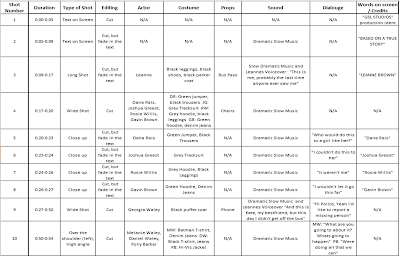
This our camera shot list.
We understand that with the changing of order and other aspects of the trailer, this will change.