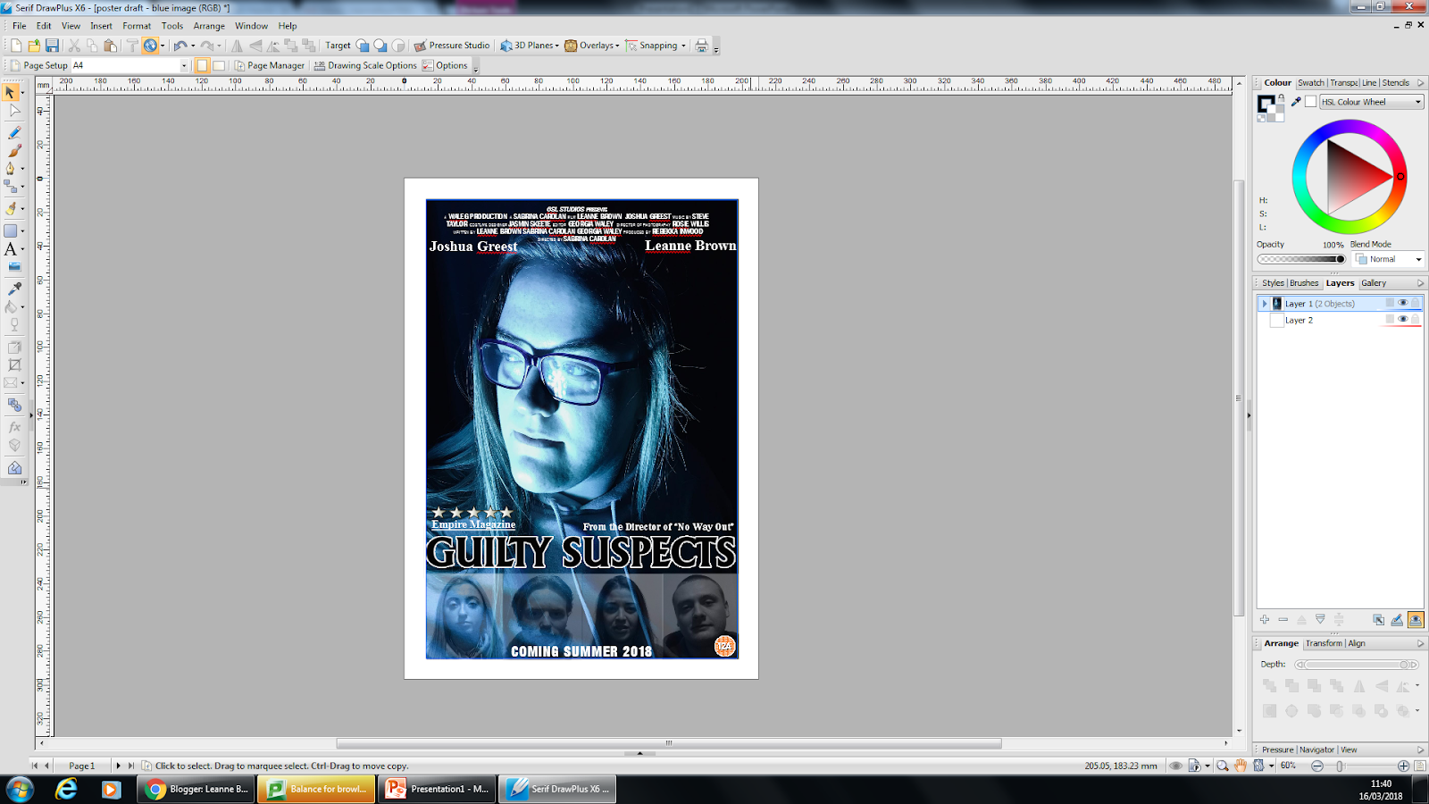
With the poster, it was quite a tough decision when it came to deciding what photo to use as we had a variety of options to chose from. This meant that many versions of the poster were being created at once. We designed two options and decided to then try other images with the design I most liked. Here are some images of the process to making the Poster.
To create the poster we used
Serif DrawPlus x6 as we are familiar with the software and know how to use it.
An idea we had before even putting pen to paper on design for the Poster was that we knew we wanted the main focus to be an image of the main character and we wanted the faces of 'the suspects' included on the front but we didn't want them to be as definitive as the main image. As a result of this we decided we wanted to fade the images. When we started the poster design, this was therefore one of the first things we did and then hoped everything would come along nicely after that was then visually a success.
Here, you see a screenshot of the four 'suspect' characters that we wanted to be imported onto the poster.
This is an explanation of how we faded the image. This wasn't as hard as we initially thought it would be. There is a brief explanation on this screenshot of how we did the fading. It was a simple process where we changed the colour opacity of the image and brung it lower down to then fade the image. We wanted this to also look similar to head shots that are normally taken of criminals as this is a crime-drama trailer we are advertising.
Once we had done this to one image, we did the same for the other three then aligned them up and grouped them together. This was so it became one unit and if we wanted to move the layout around we wouldn't have the line them up each time.
 After
After this, we imported the photo onto the document and also added the other text aspects. For the title of the film on the poster, we used the same font we are trying to use throughout the whole process.
The text and the image were then placed together and this is what the first draft looked like.
On our poster, we decided to add all the conventions as we wanted it to be the best it could for a first draft. For example, we included the billing block, however it is typically at the bottom and we have placed it at the top. We included the names of two actors that can be seen within the trailer so that the audience will recognise these names and then want to watch it even more. We have the release date, an indication as to who our primary audience will be as we've included an image of the age rating the film will be. We have the title of the film being advertised, mentioned work that the director has made before to lure audience in as if they've seen previous work and liked it, they are more likely to watch this one too. Also, we have included a rating from another magazine on the film and poster being advertised.
As I briefly mentioned, there was a disagreement as to which photo we were going to use. This is the design 2/3 members of the group preferred. With this in mind, we then took this layout but changed the image. There were three other photos we were left with.


 Here are some 'behind the scene' images of the filming process. As you can see from these images, we decided to try these scenes in two different locations. The photo here on the left, shows the two actors (myself and 'Adam') sat in 'Faye's Bedroom' which is actually Georgia's room. This location was the safest option as there was no effect on the sound quality, in fact the acoustics proved to be quite nice. On the right, you can see that we also filmed this scene in an outdoor area. This was also filmed in Georgia's back garden but we will claim it to be some kind of outdoor park or greenery if this is the location we choose to use. The risks we had to take with filming outside again was the wind. To avoid this as much as we could, we tried to wait until the wind had settles down for us to begin the recording.


 This is an image of the five final poster designs we are left. With these designs, we will carry out a questionnaire and see which one is most successful and use this as our first draft to then apply feedback and changes.


 After this, we imported the photo onto the document and also added the other text aspects. For the title of the film on the poster, we used the same font we are trying to use throughout the whole process.