Monday, 26 March 2018

Filming for 3rd Cut

 From our second draft, we received feedback that one of our scenes had bad audio from where we filmed outside and it was a windy day. We decided that instead of playing around with the sound, we would completely re-film this flashback scene as although it probably took more time, we felt it would be easier and discovered that a re-film would benefit the trailer a lot more.

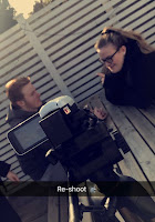
As you can see, Georgia and Sabrina are operating the camera whilst I am starring in the trailer.


Here are some 'behind the scene' images of the filming process. As you can see from these images, we decided to try these scenes in two different locations. The photo here on the left, shows the two actors (myself and 'Adam') sat in 'Faye's Bedroom' which is actually Georgia's room. This location was the safest option as there was no effect on the sound quality, in fact the acoustics proved to be quite nice. On the right, you can see that we also filmed this scene in an outdoor area. This was also filmed in Georgia's back garden but we will claim it to be some kind of outdoor park or greenery if this is the location we choose to use. The risks we had to take with filming outside again was the wind. To avoid this as much as we could, we tried to wait until the wind had settles down for us to begin the recording.
However, it is likely that we will use the bedroom location as not only does it have better sound, it shows a contrast to our other locations where as we already have a scene that is based outdoors. When filming in the bedroom, we filmed from two different perspectives of the room to show the versatility of camera angles. This will help when it comes to [possibly] editing in this scene as it will allow s to switch angles so we are able to see the important parts of this scene. For this re-shoot, it did mean that we also felt like a re-write of the script was relevant as the first script dialogue for this scene didn't really add much effect to the trailer so we tried to make it more intense between these two characters to confuse the audience as to 'who did it?'. This script re-write will be posted when the third draft of the trailer has been edited together as we don't want it to be spoilt prior to the viewing.

Filming for the third draft was quite a rewarding challenge as it made us realise this is likely to be the last footage we ever record for this trailer as the rest of the feedback was related to the digital aspects that had been added in, not the actual footage. This was a nice feeling as we finally felt like we had a good piece of footage for this scene to add in.
In conclusion, we feel like this process went well and was extremely beneficial to us and the trailer. The next step will be to sit and edit for the third draft.

Thursday, 22 March 2018

Poster Mark-Up


As a group, we have now reached a stage where we have drawn up our ideas for the Film Poster and have pictured how we ideally want it to look. We figured that we wanted the image of the main character to be the main focus of the poster as this follows the conventions we researched. We also wanted the film title to be in a bold, captivating font towards the bottom of the page so that it stands out but also doesn't distract the attention away from the main image. We have also added space at the bottom where we would like head-shots of the four other characters to show they are included in the film. However, with these images, we have an idea that we would like them to be faded into the background so they don't take the focus away from the main image. 

Within our poster, we included various other features that are features of a stereotypical film poster. For example, we have entered the BBFC rating in the bottom corner, a review and other works the director has produced.

We are well aware of the fact many things are likely to change in the process of putting the film poster together electronically. 

Poster Designs - 5 (First Drafts)


This is an image of the five final poster designs we are left. With these designs, we will carry out a questionnaire and see which one is most successful and use this as our first draft to then apply feedback and changes.

We are well aware that this is only a first draft and that whichever poster we decide to use will only be a first draft and feedback will need to be applied to make changes and there will be other drafts to follow this before the final product.

Poster Drafts and Process

With the poster, it was quite a tough decision when it came to deciding what photo to use as we had a variety of options to chose from. This meant that many versions of the poster were being created at once. We designed two options and decided to then try other images with the design I most liked. Here are some images of the process to making the Poster.
To create the poster we used Serif DrawPlus x6 as we are familiar with the software and know how to use it.

An idea we had before even putting pen to paper on design for the Poster was that we knew we wanted the main focus to be an image of the main character and we wanted the faces of 'the suspects' included on the front but we didn't want them to be as definitive as the main image. As a result of this we decided we wanted to fade the images. When we started the poster design, this was therefore one of the first things we did and then hoped everything would come along nicely after that was then visually a success.

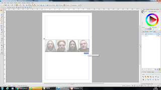
Here, you see a screenshot of the four 'suspect' characters that we wanted to be imported onto the poster.


This is an explanation of how we faded the image. This wasn't as hard as we initially thought it would be. There is a brief explanation on this screenshot of how we did the fading. It was a simple process where we changed the colour opacity of the image and brung it lower down to then fade the image. We wanted this to also look similar to head shots that are normally taken of criminals as this is a crime-drama trailer we are advertising.

Once we had done this to one image, we did the same for the other three then aligned them up and grouped them together. This was so it became one unit and if we wanted to move the layout around we wouldn't have the line them up each time.


After this, we imported the photo onto the document and also added the other text aspects. For the title of the film on the poster, we used the same font we are trying to use throughout the whole process.


The text and the image were then placed together and this is what the first draft looked like.


On our poster, we decided to add all the conventions as we wanted it to be the best it could for a first draft. For example, we included the billing block, however it is typically at the bottom and we have placed it at the top. We included the names of two actors that can be seen within the trailer so that the audience will recognise these names and then want to watch it even more. We have the release date, an indication as to who our primary audience will be as we've included an image of the age rating the film will be. We have the title of the film being advertised, mentioned work that the director has made before to lure audience in as if they've seen previous work and liked it, they are more likely to watch this one too. Also, we have included a rating from another magazine on the film and poster being advertised.

As I briefly mentioned, there was a disagreement as to which photo we were going to use. This is the design 2/3 members of the group preferred. With this in mind, we then took this layout but changed the image. There were three other photos we were left with.

First Draft - Magazine Cover

Here is an image of our Magazine cover first draft. 

Magazine Cover - First Draft - Process and Descriptions

The process of creating this magazine cover proved to be a nice challenge because it allowed us to be creative but also trying to include all the conventions to make it look more presentable. The three of us in the group all played a part in helping to create this cover and we worked well to create this draft.

The main 'issue', as such, we had with creating this was trying to get the models face in front of the text. This meant we had to add two of the same image so that we could place my body in front of the main text, but not the background of the image. Our first attempt to do that was to trace one of the images and cut out the background and then with the other image do the same but cut out my body and then piece them together. However, this proved to be a challenge as we couldn't get the right alignment with the two images.
The next solution was to use the cut out of my body but leave the second image of the whole photo and then place the cut out body over the real image so that if there was a miss cut it wouldn't matter or it wouldn't be visible to the audience, this was the best way and is what we decided to do.


This is a breakdown of the three stages it took to get the main image we wanted. As you can see, the cutout of my body isn't overly perfect or spot on but it works for what we wanted it to look like. From this, you can see that the programmer we used to edit was Serif DrawPlus x6.
 To get the image of my body on its own, we used the cut out tool. This software enables us to use a cutout tool. As you can see in the yellow box, there is a brief explanation too.


 Here is a breakdown of what it looks like when the cutout tool is opened. I have also annotated the three main sections I used and briefly explained what they are used for.


From this, you can see that it was not an easy process that we undertook to get this outcome. However, as we had knowledge of the programme it was a lot easier to use and navigate ourselves round so that it took detailed time but not too much time.

The next step was to add the text and other conventions of a magazine cover. We had already included the title (master head) and we needed to add cover/tag lines, straplines, feature article cover line etc.

This is what it looked like once we had created and added the text that we wanted to be included and had thought about where we wanted it to go on the page.


Finally, this is what our first draft looked like when we had pieced it all together.


As I have mentioned, this is only our first draft and we know that changes will need to be made. We have already discovered a few since creating it.

For the feature article cover line we chose to use a quote from an interview that was included inside the magazine. We felt like this would capture the audience's attention enough for them to want to read about it. We tried to include at least one enigma code within the quote so they could buy the magazine, find out some of the answer and then want to watch the film to discover the rest.

We also used a sticker image that we imported onto the left hand side of the magazine that states "Free Posters". We felt like the freebie would entice in more audience also because they would like free gifts. This could of been seen as a technique to 'sell' the magazine.

In our trailer, we tried to maintain a similar colour scheme throughout. For example, we used yellow, black and white. This is called a colour palette which is meant to attract more of an audience as it looks aesthetically pleasing.

On our magazine cover, we tried to use as many different fonts a possible whilst trying to keep it professional and not too tacky. This is also a method to attract audience as it will look better on an initial glance. We used large fonts too and some highlighted outlines to make it stand out and to look better than other magazines.

Our central image is of the main character so that they know who the main feature article is based on. The name of the model (me) is underneath the main feature cover line and the quote included.
We used straplines at the top (above the master head) to include some other articles in the magazine to make them want to read it even more. Other little details were also added to give more emphasis and meaning to the magazine cover. Over time, and once receiving feedback, we will be making changes to the magazine that need to be changed in order for it to look better and include the maximum it needs.

Monday, 19 March 2018

Mark-Up of Magazine Cover


As a group we have started planning what we want our magazine front cover to look like.  We decided that we wanted the majority of the page to be taken up with a photo of the main actress in our trailer.  We want to do this as this is a key convention of film magazine front covers and many well established providers use this convention.  We want our master head to be in a bold, recognisable, large font but not taking away too much attention from the title of the featured film, so we will attempt to have this behind the image of Leanne, this also happens to be seen a lot in film magazines.  The masterhead is also a crucial convention for a magazine front cover so we want to make ours as professional as we can.  The title of the feature film must be displayed in large font on the magazine front cover in order to grab the audiences attention and bring it to the feature film.  We decided to have this in a large black font going across the image and in the middle.  This allows the image still to be seen yet the name of the film to be very prominent.  We have added in a barcode and price as this is key for when the consumers purchase the product. 

There are various other strap lines and 'add-ons' on the magazine front cover.  The main aim of these is to draw in audiences who may not necessarily be solely interested in the feature film but to show that there are other exciting features in the magazine.  This will hopefully be an incentive for them to buy the magazine and therefore 'stumble' across "Guilty Suspects" accidentally and hopefully become interested, bringing in a wider audience. 

We understand that as the process of creating this goes on things may change however this is a template we aim to stick to as we believe it to be aesthetically pleasing and interesting for audiences as well as following the key codes and conventions of a film poster.  

Film Magazine Title Ideas

Here is a mind map of ideas for a title for the magazine we are creating.


Once we had created this mind map, we used it as a mini survey to ask a few people their opinion on which title sounded better. From the results we gained, we discovered that “Focus!” was the most successful and scored the most selections. Therefore, we have decided to use this as our Magazine Title.


Saturday, 17 March 2018

Magazine Cover Analysis (1)


SPECTRE - MAGAZINE COVER ANALYSIS

The main function of a magazine cover is to make it eye-catching, interesting and to sell the magazine. I will be analysing how this magazine does that.


The mast head is the first thing that instantly draws my attention in. This is the brand image at the top of that page that makes this poster recognisable to the audience. This stands out as it is at the top of the page, and it is also written in a large, bold and distinct font. Another reason the mast head could draw the audience in is because it is written in a white text in contrast to the main colour scheme. I believe that the magazine has done this to make it stand out from any other magazine trying to sell or advertise this film.

On the left side of the page, we are shown the tag lines which are the main bulk of text and it states what other articles can be found within the magazine. This is an advertisement technique to try and lure the audience into reading it further than the front page and to actually purchase the magazine. However, they use the main story on the front page that they believe the audience is more likely to want to read. Just under the ‘Empire’ title there is a cover line that reads “The world’s biggest movie magazine”. This has been added to make the audience feel like there is no other magazine that will compare to this with regards to the content and its ability to intrigue its audience.

Many magazine covers use a slogan. In this case, the cover says “Ultimate TV Preview: The 27 Biggest Shows in 2015”. This is to briefly explain the content and to make it stand out that little bit more.

We also see the straplines at the bottom of the page that state other famous, recognisable, actors/actresses that are included. This could be used as a USP (unique selling point) as the creators of the magazine could see these actors/actresses being of a high enough rating that it would make people more likely to buy the magazine. This is mainly to highlight the stars in the magazine.

The second biggest piece of text on the cover was ‘Spectre’ on the left hand side of the page above a list of some content. This is the feature articles cover line that is bigger than the rest to intentionally dominate the rest of the page. This tends to be the line that the producers believe will ‘sell’ the magazine best.

From this magazine, we can see a few different fonts that have been used on the cover. This is supposedly done to create an aesthetically pleasing feel for the audience when they first look at the magazine as its meant to capture more attention. Although this magazine doesn’t have a multitude of different fonts, there is a clear difference between the master head and to cover lines which is the most important thing as they are the two main parts of text.

This central image is of the actor Daniel Craig who plays ‘James Bond’ in ‘Spectre’ which is this film that the magazine is advertising predominantly. This shows a close up head shot of the actor which is a conventional aspect to a magazine cover. The close up shot is an aspect of direct address which is believed to immediately make the audience feel like it is aimed at them. This central image shows that the ‘Spectre’ film will be the feature article of this magazine. The fact that Daniel Craig is facing forward in the image is called ‘the gaze’ and this is seen to create a relationship between the magazine and the audience to welcome a bond. This is a common rule of a magazine cover although some models do look away.

On every magazine, it is highly likely to have a barcode and a price clear to the audience. More-so now days, some magazines will also include a web address that is a link to the same content but online instead of printed. In this case, we see that a barcode isn’t actually visible on the front cover of this magazine but we do see a price that comes just underneath the magazine title. This is an ideal positioning as people will always look at the bigger text and from that they will see the price underneath. This allows it to be clear to the audience as it is important they know how much they will be paying. It is evident to the audience that this magazine was published in 2015 and therefore probably wouldn’t have included a web address as it was just becoming a thing then.

A convention of a typical magazine cover includes a colour palette. This is essentially to show a defined choice of colour to create a recognisable style and image for the audience. In this case, the main colours used are a pale blue, grey, black and white. The colour scheme that has been used for the cover reflects the image that Daniel Craig has personally presented. For example, the blue text correlates with his blue eyes. The black background shows the dark nature of what persona ‘James Bond’ carries and also matches the colour of the gun. Finally, the white is mainly used to insure that the text stands out on the black background but he is also wearing a white shirt. Small details like this could make a great difference when it comes to choosing which magazine looks more appealing without reading inside of it.

Overall, it appears to me that this magazine cover follows many of the conventions that a typical magazine cover should have. This shows that it is a good example and therefore will be useful when it comes to inspiration for making my own magazine cover.

Magazine Cover Analysis (2)


DARK KNIGHT – MAGAZINE COVER ANALYSIS


The first thing that catches the audience attention from this magazine cover is the mast head. This is used to create a branded image and instantly recognisable to the audience.

This cover has also used a slogan, which is usually placed under the title and briefly explains the content of the magazine. In this case it says “Batman VS the Joker – summer just got serious”. This explains what is inside the feature article of this magazine in a short declarative.

The straplines at the bottom of this cover state who else is included inside this magazine and the title of the film they are in there for. These straplines follow the stereotypical conventions of a magazine cover. This can be seen helpful for ‘selling’ the magazine as if they see there are more recognisable actors/actresses included then they may be more likely to buy the magazine.

The central image is the second thing that catches my attention when first looking at this magazine cover. The central image is generally a close-up head shot, which in this case it is. The photo is usually a face forward as it is seen as direct address. This is called ‘the gaze’ and is believed to create an attachment between the magazine and the audience that will push the audience to buying the magazine. On this cover, we see the model facing forward with their eyes piercing forward directly addressing the audience, making them feel it is solely aimed at them.

The feature article cover line is usually bigger than the rest of the other texts, apart from the title, as it supposedly meant to take domination of the rest of the page. This tends to be the line that producers believe will best ‘sell’ the magazine. This magazine cover reads “Clint makes our day” this could be seen as an enigma code as it produces many unanswered questions for the audience. This proves to be a good decision on the producer’s behalf as this will make the audience want to know the answers to the questions which they will presume to be inside and will therefore buy the magazine.

On a typical magazine cover, there should always be a barcode and the price of the magazine so that the audience can be aware of how much they are expected to pay before actually going up to find out. The front cover of this magazine shows both of these aspects; proving that this cover follows conventions of a magazine cover. In some cases these days, the magazine producers will sometimes include a web address too. On this cover, we see the barcode is placed at the bottom right hand side of the page – next to the straplines – which makes this visible to the audience. The price of this magazine is placed in the mist of the mast head. Again, this is cleverly placed as this will be one of the first things the audience see’s after recognising the producers.


With many covers, there stereotypically will be many different fonts used for the magazine. This is meant to make it more appealing to the audience and interesting to look at. This magazine however, appears to not have used a variation of fonts which some magazines, evidentially, do. However, I believe that this doesn’t get rid of the audience as the colours will still lead them to reading the cover.

A typical magazine cover will have a colour palette that created a more recognisable image and style.With this magazine cover, the colour scheme that has been used includes blue, black and white. This colour palette proves to be effective as the black background and mask of the model emphasises the blue text, making it stand out, which in turn means the audience are more likely to read it.

In conclusion, it is clear that this magazine cover follows many of the stereotypical conventions and although it doesn’t include some, it is still proved to be a successful magazine cover. Now completing this analysis, I can be certain that it will help me when it comes to making  my own magazine cover.  

Magazine Cover Analysis (3)

JASON BOURNE – MAGAZINE COVER ANALYSIS 

The first thing that immediately draws my attention in is the mast head at the top of the page. This immediately shows the audience the branded image they are creating and makes it more recognisable for the audience. Although this has been slightly covered by the central image, it is still clear as to what it says and who the producers are. The blue, large font also stands out because it is on a black background.

On this magazine cover, the second thing that I take notice of is the central image. This shows a medium shot of the model looking directly at the camera. This is meant to represent direct address. The fact their eyes are facing directly forward allows the audience to create a bond with the magazine before even reading it and that is what is meant to help make a decision. The central image is usually a representative of the feature article content.

At the top of the magazine, the producers have placed a cover line to inform the audience of another article that is included. These are the main bulks of text on the magazine and generally include what articles are featured too. On this magazine, we see that ‘Suicide Squad on-set exclusive’ is included. In the ridge of the ‘M’ from ‘FILM’ they have placed a photo of the main character from suicide squad to make sure it is noticed and not completely disregarded. There is also a tag line on the centre of the cover to reveal the main feature article of this magazine is including ‘Jason Bourne’ with the sub-tag line ‘the badass is back’. These are believed to ‘sell’ the magazine more to the readers.

Just under the main feature article cover line, the magazine creators have included a quote from Matt Damon. The quote reads “we needed to go big, and we did” to many viewers of this cover, this will present them with many questions which they will want answered and are therefore liely to buy the magazine and read it. This could also class as a feature article cover line as it will be a huge help towards ‘selling’ the magazine at first viewing. 

Conventions of a magazine cover include having a variety of fonts included on the cover to interest the audience more and to make it look more appealing. In this case, the producers have decided to use many different fonts which pay of as the cover does look more intriguing to the audience. The text on the cover is one of the initial things the audience will see and making it all different fonts will therefore make audience pay more attention.

From this magazine, we can see that this cover has used a slogan. These are usually placed underneath the title and it explains the content of the magazine to make it different to the rest. The producers of this magazine have used the slogan “the smarter movie magazine”. This has been used to make a magazine seem smart (as if that is even possible!) and so the audience will want to read this as they will more than likely want to be the smartest. It will make the audience doubt that any of magazines worthwhile. This is a clever choice by the producers as this will lure a mass audience in to reading the magazine.

A typical magazine cover should include a barcode and a price so that it is easily accessible to the readers. This magazine appears to have a barcode but there is no price visible. This won’t make a different to the selling of the magazine as the rest of the cover is enough to ‘sell’ the magazine to a mass audience.

Many magazine covers will have a colour palette that will be used consistently. The intentions of a colour palette are to create a recognisable style and image for the magazine so that the audience take notice of it. This magazine cover has gone with the distinctive colours: blue, black, grey and white. These colours have been used to reflect off each other and have been used with good correlation. The black background emphasises the blue and white text and the grey coloured text shows the depth of the magazine.

As a result of this, I believe this magazine to be a good example as it follows many of the typical conventions of a magazine cover. This magazine cover analysis will also help me when it comes to creating a magazine cover of my own.

Thursday, 15 March 2018

Second Cut Questionnaire Feedback

Here are some of the feedback forms we received. This proved beneficial to us as it allowed us to reflect on improvements maybe we didn't think about and see what they particularly liked about the trailer.

This feedback form was filled out by a teacher so that we could get some feedback that related to the exam board as well as for an audience member. 

We received this feedback form from a member of our media class. This was helpful as it meant they knew what we had to include and how difficult it is, but also provide advice on what they would do differently and how it bettered from the first draft.

This as also from a member of our media class. Again, this was helpful as it meant they knew what we had to include and how difficult it is, but also provide advice on what they would do differently and how it bettered from the first draft.

Again, this was from a member of our class. This also proved beneficial because we sat and watched it with them so we got written and verbal feedback but it also enabled us to see their reaction to the trailer as it was playing. 

This was from a member of our class. This also proved beneficial because we sat and watched it with them so we got written and verbal feedback but it also enabled us to see their reaction to the trailer as it was playing. They knew what we had to include and how difficult it is, but also provide advice on what they would do differently and how it bettered from the first draft.

Second Cut Questionnaire


This is the questionnaire we created to hand out to viewers of the second draft just so we could get an idea of what they thought. We also received verbal feedback that has been written up with how we plan to accommodate this feedback in our next draft.

Wednesday, 14 March 2018

Second Cut Feedback

The overall feedback suggested an overall improvement which is what we were obviously hoping for with it being a second draft. 

From our first draft feedback, we got told that the trailer could benefit from a change in music to create more of a dynamic within the trailer. However, when we showed the second draft where there was a change in music, we received feedback that the transition was not subtle enough and they said it felt like it revealed who committed the ‘crime’. Due to this feedback, our next draft of the  trailer will have a smoother transition of music and maybe a less dramatic drop son that no indication to who did it is revealed. 

Now we've added in text between the footage to add suspense an give the audience questions to think about, although they wont get the answers until they watch the film, the main part of feedback we received from this was that its liked and it looks good but the falling letters onto the screen doesn't really fit with the rest ion the trailer. To improve this for the next draft, we will re-evaluate what font we use to make sure it is gripping.

Another piece of feedback we received from our second draft was that the story line is still too clear. although the audience don't actually know who did it, they can guess as to what is going on. Also, they suggested that something more exciting and engaging happens that half implies what does happen but doesn't actually reveal the full ending so that it captures the audiences attention more. This presents us with a decision of whether we want to film new footage and edit it in or take out footage to take away some fluidity. 

Since the first draft, the conventions and the order does represent a trailer now more than it did before but the story is still a bit too fluid. One piece of feedback suggested that because of the voice overs, that the characters maybe have been introduced too much and that doesn't help when it comes to the storyline as it answers too many questions so the audience are able to follow although they shouldn't be able to this much. This will be discussed further, but we think the best solution will be to remove these voice overs. 


One other main piece of feedback we received, was the fact that in the scene where two characters are in the park, the audio is really bad because of the windy weather which therefore makes it hard to hear what the characters are saying. For a resolution, the best answer will be to complete re-film this section and possibly change the location so that sound wont be a problem.

From the re-ordering of the whole trailer and the jumbling up of scenes, we put the title after the release date. Feedback we gained from this suggested that the title not only needs to be before the release date, but it also needs to be seen a lot earlier in the trailer. 

Although we have the voice overs and we have non-diegetic music, it was put forward as a suggestion that we could add in sound effects to create more tension and dramatic effect for the audience to stay engaged. The feedback also implied that the trailer needed more ‘umph’ .

Overall, we are pleased with the feedback we have been given as it will help better the trailer and it also gets us being more creative with the footage we have. It allows us to reflect on our work and then make the improvements. The feedback we have received isn't going to be a challenge as its all relatively simple as we know exactly what we have to do now to improve it all. 

Editing and Re-Filming Process (2nd Cut)

Here is an image of Georgia during our second editing process. For our second draft there were very few chances that had to be come in order for it to improve. The main changes included: adding in separate blanc screens for the names of the actors/actress', moving the order around so that it looks less fluid and more like a trailer not a film opening, add some dynamics to the sound to create more of an atmosphere and re-film some shots because of the audio of the location we filmed in.

As a whole, this didn't take as much time as we thought it would. The re-filming took a couple of hours then all we had to do from then was sit at the computer working with the software and piecing the footage together to make it look good and cut out the parts that couldn't be used.

Although this second process wasn't as time consuming as the first draft editing process was, I felt that this one was more vital and it needed more attention to detail for this one. The vitality of this process sprung on me as it had to be an improvement of the first draft and we had to added pressure if making it better.

Another difficulty, was deciding what font to use for the different blanc slabs between footage that provide the audience with questions that they will want to know the answer to. Upon receiving feedback, it appears we have decided on the wrong font so this will be changed next time. Also, relating to the black screens with the text, we wanted to add text transitions especially with the names of the actors and actress' so that it was engaging and the name didn't just boring appear and disappear on the page.

A final thing we had to change was the order of the trailer. This became quite fiddly because of the added sound and then trying to re-match the timings of the footage, soundtrack and voice over so that it still matched. The reason we had to change this was because the feedback from our first draft said that it looked too much like an opening sequence although the footage, camera work and angles were really good, it was too easy to follow a storyline.

In conclusion, the second process of editing was quite fun as we knew exactly what to improve and we had a base to work with instead of completely from scratch and we had an idea of how it was going too look in the end. We will now be working on the third draft.

Tuesday, 13 March 2018

GUILTY SUSPECTS - 2ND Cut

This is the second draft of our film trailer. We tried to take on board the feedback from our first draft and implement this into this version. We will be doing the same process of making a questionnaire and gathering feedback from peers and other and then creating more drafts.

Monday, 5 March 2018

Film Poster Analysis (3)


TITANIC – FILM POSTER ANALYSIS

I have chosen to analyse this film poster as its genre is drama and that is a sub-genre for my coursework. Analysing a drama poster as well as crime posters will help me better the film poster I end up creating for my crime-drama poster.

This film poster follows many of the conventions that have been put in place. For example: eye catching, captivating, there is a picture as the focal point to lure in the audience, the font is large bold and stands out, it is designed to attract a mass audience, there is a billing block evidently at the bottom, and we are shown a hint of who the main characters are likely to be.

The first thing that stands out to me is the image placed at the top centre of the page as the colour has been sharpened to stand out even more. This image acts as an indicator as to who the two main characters are. On any good film poster, there should be an image on the front to make it stick out and more appealing to the audience.

The title text on this poster has been designed well as it clearly stands out from the majority of the rest of the posters aspects. The white font on a dark background allows it to be pinpointed a lot easier. The large size leads it to ‘jump out’ of the page. The text is slightly spread out allowing it to be further across the page, also helping it to stand out. The title on a poster is vital to stand out as it is something that is needed to be remembered.

Under the image, and above the title, the names of the two main characters on the front as shown. In this case, they are placed in the order of popularity to which the creators think will be more beneficial to the viewings of the film. Usually, the names are placed in order of the positioning in the photo. Part of the conventions of a film poster indicates that the name of the main actors involved should be placed on the poster.

At the bottom of this poster, we also see the billing block. This is used to highlight the people involved with the production and direction of the film. This is useful on a film poster as the audience/readers are able to see who has directed it. If the viewer is familiar with their work, it makes them more likely to watch the film, especially if they’ve liked the other films. Also, at the very top of this poster, we see examples of films that the director has also directed and been a part of. This is one of the conventions as similarly to the billing block, it is used to lure the audience in if they are familiar with previous films and have liked them.

From this film poster, it would suggest that a target audience of this film could be teen-twenties as they are the stereotypical audience to films that involve love scenarios. This is the connotations I have been left with from this image. This would appear to be more of a niche audience as it isn’t aimed at a wider social group or community.

In conclusion, it is clear that this poster follows many conventions of a generic film poster. Although it has some conventions missing, it has included the majority of them.

Film Poster Analysis (2)


COLD COMES THE NIGHT – FILM POSTER ANALYSIS


This poster is advertising a crime film that is soon set to be released. The analysis of this poster will include what effects the decisions have on the poster and a possible answer as to why these decisions have been made by the creators. I have chosen to analyse this film poster as its crime genre is similar to our genre of Crime-Drama and I believe it will benefit me when it comes to creating my own film poster.

The first thing that drew my attention in was the title as it has been written in a large, bold font so it is obliged to stand out from the rest of the poster and it dominates the other factors. It has also been placed just down from centre to represent the fact it is part of the main focus. The capitalisation also emphasises its importance on this poster. The title of the film is obviously an important factor and the conventions of film posters say that a title should be placed central to the poster and using a distinct font and size. This poster is an example of this as it has been written in a large font, capitalised and almost central of the page. This has been chosen so that it is eye catching and easy to remember for the audience.

This poster follows the conventions of a Film Poster as it not only has an image of the main characters as the main focus, the poster is also captivating. It is also evident that there is a billing block at the bottom of this poster. A billing block consists of the companies, actors, directors, producers, and other crew members that were involved with the film so they are given credit too. Billing blocks could be seen as a key aspect of a film poster as it is important to some viewers that they know who was involved with the whole process. Also, in the red text below the billing block, there is a date of release to show when the film will be out, in this case it is a specific date as it has given us the month and year it will be released. This needs to be added onto a film poster otherwise the audience will never watch the film as they will be unaware of the release date. A final convention that this poster has followed, is the fact it has listed famous actors that people will be familiar with and shows who is in the film. This could be seen as a USP (unique selling point) as people may want to go and see this film as it includes an actor they like.

With regards to a film poster using an image as the main focal point, this factor allows the poster to be more captivating and eye-catching as it is the first thing the receivers are likely to look at first. The image on this poster acts as an indication of the crime genre by the colour palette that has been used and the expression on the actors faces. With the colour palette, the darker, colder colours have been used to show the harshness of the film. The grey, icy colour could suggest the cold-hearted action being made by someone in the film. In respect of the colour red that has been used, not only for some of the text but also as a screen on the actors glasses, could be a representative of the crime genre as it is a stereotypically connotation of crime as red signifies both danger and blood.

In the red text just next to the title, we see two short declaratives that give the audience an insight as to what may happen in the film. It reads: “She found a fortune. He found a target” this suggests that the film is also following the stereotypes of the crime genre as it is usually the male who plays the role of the antagonist and the female being the protagonist. As we read into this, it shows that the poster is being accurate in trying to lure their audience in as it gives an insight of the action, but uses words that make the viewers want to see this film.

Overall, this film poster is a good example as it does follow the typical conventions.

Film Poster Analysis (1)

TAKERS – FILM POSTER ANALYSIS

I have chosen to analyse this film as it is a crime genre film and I believe it will help me when it comes to designing and making my own film poster. In this analysis, I will be testing whether this film poster follows the conventions of a stereotypical poster.

As a poster on a whole, it follows conventions such as: it's eye catching, captivating, there is a
picture as the focal point to lure in the audience, the font is large bold and stands out, the poster clearly defines the genre of crime, it is designed to attract a mass audience, we are told the film is going to be released soon, there is a billing block evidently at the bottom, and we are shown a hint of who the main characters are likely to be.

With this poster, the first thing that catches my eye is the image that has been made the centre of attention on this poster. The image appears to show two male characters holding a gun. This prop helps suggest that the film being advertised is a crime film.

The two main images on this poster reveals that there are six main characters, all of which are men. Along with these images, the names of these six characters are placed at the top of the page. This is a stereotypical convention of a film poster as it is key to most audiences that they are familiar with what actors are in the film. The order of the names usually follows the order in which we see the characters presented on the picture. However, in some cases, the creator place the name of the actor with most following and recognition as they believe it will lure an audience in sooner and easier if they are  more familiar and more in tune with the actors.

Although the text is not placed in the centre of the poster, and it isn’t the biggest thing to be seen on the poster, it is still able to draw in attention. This is due to the fact it has been written in a bold and distinctive font. The spacing between the letters allows it to be spread further across the page which does help when it comes to picking out the title. The title on any poster is vital as it is crucial information for the audience. With this being said, it is good that the title has been made extremely clear. Regarding the colour of the title on the poster, it is quite a key factor to pick out that the title is written in a lighter font just to get a final punch of dominance over the rest of the poster.

At the bottom of this poster, we can clearly see the billing block that has been included to present information to the audience. A billing block is used to sate the names of the production team and directors so that they are given credit too. This could be crucial to some audience members as if they are familiar of previous work from named directors, it’s more likely to make them want to see this film too if they liked the others. Under the billing block, we see ‘coming soon’ displayed which acts as a non-specific indication of when the film is being released. As it is unspecific, the audience are still unaware of the release date so we presume there will be more advertisement soon.

From looking at this poster, it seems to me that the targeted audience would be middle-aged men. This presents itself to be a niche audience. One reason I would say it is aimed at middle-aged men is because that is who I associate crime films with but, from looking at this poster, the fact they are all men of an older age and they look like people men would aspire to be like. On the other hand, it could be argued that a secondary audience could be women too as this is what they could aspire to be with. Maybe they like the idea of men taking charge and committing crimes and will therefore want to see the film. With this in mind, it could now be said that the poster attracts a mass audience as there is more than one social group that is interested in watching this film.

The colours used on this poster are a contributing factor to help make the genre clearly defined. The colours suggest a misty, foggy and dark atmosphere to represent the dark nature of gun crimes we are led to think they will be committing.

In summary, this film poster acts as a good example as it follows many of the stereotypical conventions that have been built together over the years.